piątek, 7 czerwca 2013

& Studio Dumbar

Actually I'm reading one of polish design quarterly and there I found this sentence:

'(...) everyone not only mention Studio Dumbar, say something about typography, but also recognize dutch style.'

Now u think 'what?' or maybe 'what she wants to say?'. I will write u what I thought. Let's have a look at my mind and my thought:

'EVERYONE mention Studio Dumbar, I do NOT know Studio Dumbar... f***'

Of course I cannot know everything (let's admit... my knowledge about design is still so
looo
ooooo
oooooooo
oooo
o
oo
o
www)

But when 'everyone' know about something and I don't I'm soooo angry ;). So to all this EVERYONE - NOW I know and I mention Studio Dumbar in my post. Yeaahhh!

Should I write something about this dutch design agency or maybe u want to do this on your own? On your own? Great! Click this

Here some of theirs work:


wtorek, 28 maja 2013

& beer

Tuesday's evening and visit in Tesco. Despite looking for the cheapest mozzarella and delicious candied orange peel in dark chocolate I went to the beer area. At first glance everything as usual - I see Lech, Tyskie, Warka etc. And then, of course at the lowest shelf, I found nice surprise... Łomża Beer. The best thing in this design (made by Touch Ideas) is beeing totally different than others. Ok... someone can says that 'It's so simple' etc. But do u see a lot of simple things in our polish supermarkets? Łomża desing was refreshing for me. Let me introduce u more beer design (found as usual at thedieline). Maybe some will refreash u as well?


niedziela, 5 maja 2013

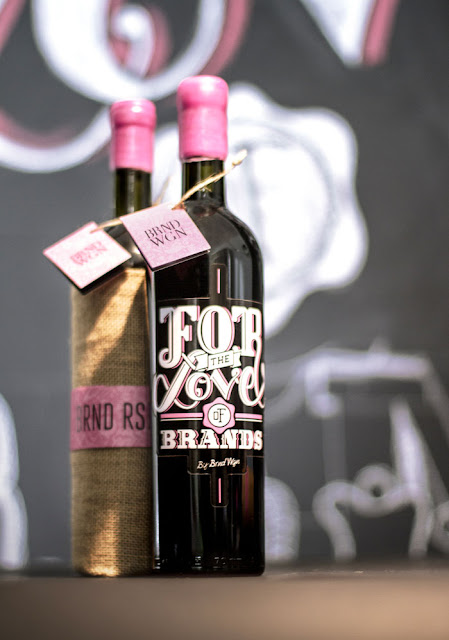
& wine

Wine brands design...the only limit for creativity is a characteristic wine bottle? Is it limit or is it a challenge? Despite that designers can experiment and create small pieces of art. I don't know why but beer or vodka design is usually more...crazy. Is it because we associate wine with civilized manner drinking...so it should be more serious?